Conventions
Spatial Awareness/Layout:
- The crease
- Optimise space
- Wrap texts (manipulate)
- Blank Space used if effective (fits with message)
- Different channels have different layouts and logos
Cohesion between texts:
- Formality
- Tone
- Font (consistent)
- Colour scheme
- Linked to documentary and written
Image:
- MUST be manipulated
- You MUST show how you've done this/justify why
Colours:
- Fit topic
- Fit images
- Consistent
- Readable
Checklist for DPS
- Heading
- Sub-heading
- Statement
- Quotes from text
- Text
- Page number
- Image (manipulated)
- Date and air time
- Name
- Sub-heading
- Statement
- Quotes from text
- Text
- Page number
- Image (manipulated)
- Date and air time
- Name
Example of DPS
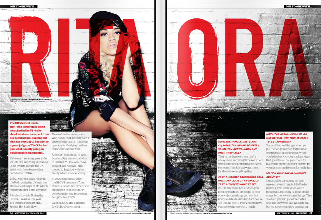
Font:
All of the font on this double page spread is consistent. The font is consistent for each section of text. The questions are all bolder, italic, red and a different font from the main subject of the text. Not only does this signify that it is what the following text is about but that it is vital and important.
Colours:
The double page spread has a suitable colour scheme that not only suits the article well but also the colours suit the artist as well as what the content is about. As well as this the image in the background has similar colours. This is like the colours have been taken from her jacket and the surroundings and used for the colour scheme,
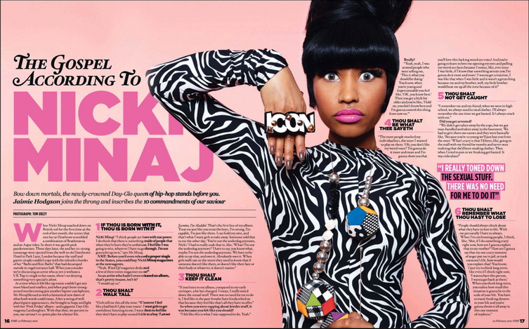
Colour
The bright colours used in this article show her feminine side as she is seen to be in a very male dominating industry. The pink colours also fit along side her title of her latest album, 'Pink Friday'.
Layout
Each paragraph is going around her body, which makes her stand out more. This brings more attention to the text on her right. The positioning of the images makes it so that her body isn't affected by the folding page. Her arm will be but her main body will not.
 RSS Feed
