In what ways does your media product use, develop or challenge conventions of real media products?
How effective is the combination of your main product and ancillary texts?
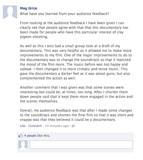
What have you learned from your audience feedback?
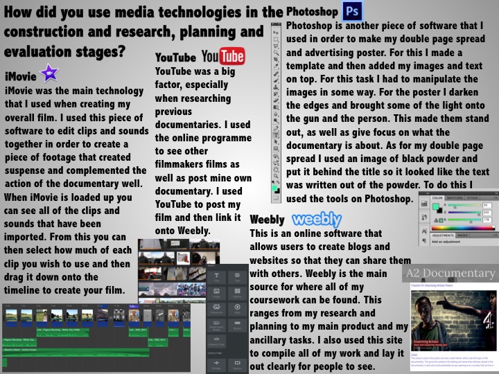
How did you use media technologies in the construction and research, planning and evaluation stages?


 RSS Feed
